The Bitcoin community has yet to agree upon a universal symbol for sats, the smallest division of bitcoin. But I think I might have a winner.
This is an opinion editorial by Arman The Parman, a Bitcoin educator passionate about privacy.
Bitcoiners are having trouble settling on a unanimous choice for the sats symbol. I have seen several suggestions with no obvious winner.
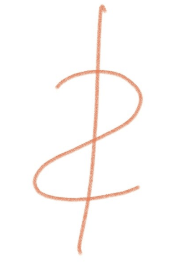
I believe I have discovered a symbol that we might all agree on — it seems obvious in hindsight. But wait until you hear the reasoning and symbolism before deciding. Here's the symbol I am proposing:

The symbol is made with a reverse "S" which is like writing a "2" (but not quite), and a vertical strikethrough, which is like a "1." The number two and the one together also make 21, referencing the 21 million bitcoin hard supply cap.
The sat symbol. It's poetically beautiful in my opinion.
What's more, it's a vertically-reversed dollar sign, which is representing the anti-dollar, or the dollar-killer. Alternatively, it’s a horizontally-reversed dollar sign (it can’t be both, otherwise it would end up flipping back to the dollar sign).
One of the most important things about the symbol is that there’s a reasonable chance that most people will naturally agree to use it. There has been a very quick and overwhelmingly positive response to a tweet announcing the symbol, posted under my public Twitter account.
This was a typical response:

And others:

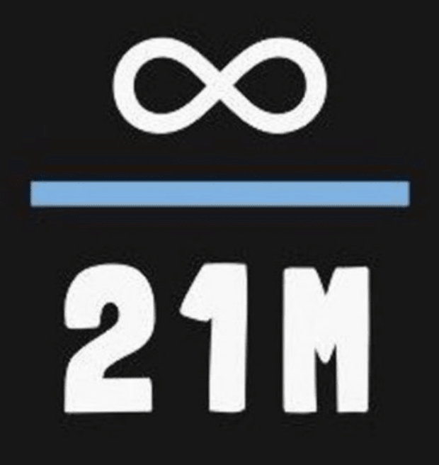
Another Twitterer commented that the reverse “S” and strikethrough can represent the first and last letters of “Satoshi,” which was interesting. Others have said that it contains elements of Knut Svanholm’s “infinity” divided by 21 million meme:

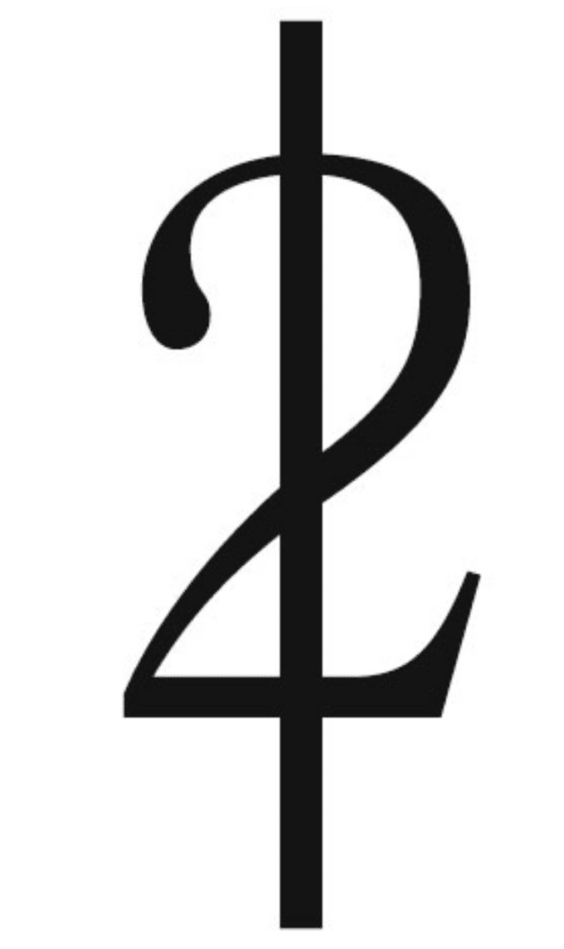
An actual “2” was suggested instead of an “S” but that can look a little messy when written in front of actual numbers, and is unlikely to get as much support as I’ve witnessed with the inverted dollar sign. It also doesn’t look pleasing to my eye:

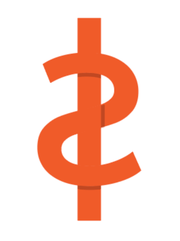
To me, it looks better with an “S”:

We've already agreed on 21 million bitcoin, or 2.1 quadrillion satoshis — anchoring this Schelling point to a new one I think has a great chance of success.
Someone else suggested it looks like an “L2” — fitting because sats are the default unit on the primary Layer 2 protocol, the Lightning Network.
It’s also important to consider the ease and speed of writing this symbol. It only takes two pen strokes. You only need to lift the pen once. The more decorative the symbol, the more annoying it is to write it by hand, and then, it will just get abbreviated.
I love the idea of reinforcing the 21 million cap “brain virus” every time someone writes the sats symbol. At least for me, it would bring great satisfaction to write it each and every time.
No matter which symbol is your favorite, having everyone agree has been part of the problem. Because there are so many reasons that this is a good symbol, I think there’s a good chance that we might settle on this one.
This is a guest post by Arman The Parman. Opinions expressed are entirely their own and do not necessarily reflect those of BTC Inc or Bitcoin Magazine.
source https://bitcoinmagazine.com/culture/my-suggestion-for-the-bitcoin-sats-symbol

Post a Comment